(W.E. Talk) Why does Paris 2024 Olympics logo feature female face?
By Mo Honge, Zhao Li
(ECNS) -- The 2024 Paris Olympics logo, with its unique design and rich cultural connotations, creates an enlightening visual symbol, demonstrating both tradition and innovation.
What was the original intention behind the design of this logo? What profound meanings does it attempt to convey and what impact does it have on traditional concepts?
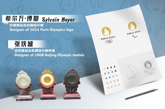
In the latest W.E. Talk, Sylvain Boyer, designer of the Paris Olympics logo, and Zhang Tiecheng, designer and producer of the 2008 Beijing Olympics medals, jointly explore the inspiration and cultural connotations behind this iconic work.
By designing a female face on the Olympic logo, it breaks traditional concepts, said Boyer. The image of women is usually associated with “beauty.” However, Boyer hoped to find a broader symbolic meaning behind the female image.
Zhang said the Olympic Games are a cross-racial event, and the inclusion of women has made sports both powerful and aesthetically pleasing. The 2024 Paris Olympics logo reflects this inclusiveness and the progress of society.

Inspiration from Boyer’s daughter
Designed in a circular shape, the Paris Olympics logo is composed of a gold medal, the Olympic flame, and face of Marianne, with the silhouette of the gold medal forming its golden background, symbolizing the pursuit of higher athletic achievements. At the center of the logo is the Olympic flame, originating from ancient Greece. Below the flame, a touch of golden lips is cleverly used to outline the facial contours of a short-haired woman -- Marianne, the symbol of the French Revolution.
It is the first logo in Olympic history to depict a human face.
Talking about the inspiration for the logo's design, Boyer said that the playground of his daughter’s school in Paris is quite small. His daughter told him that boys play soccer on the playground, taking up most of the area, leaving girls limited space to exercise."
The words inspired Boyer with the idea that women should also be the main character of the Olympics. This idea became the embryo of his design.
Traditionally, the image of women is associated with the concept of beauty, while sports are often linked to men, Boyer said. He noticed that when people make a quick search online for logos related to sports, the results are mostly images of boys, muscles, etc, whereas this is not the reality of sports. He believes that sports should include both men and women.
The designer said the logo shows sports is inclusive. “For us, it changed a lot,” he added.
In fact, the decision-making process was not easy. When Boyer first revealed female face design, there was a lot of debates within the team, such as “Is it good? Is it bad? Is it sensible?”
Ultimately, a consensus was reached. The team believed that women could also represent the Olympic spirit, so they created a more feminine image for the Olympic emblem.
By placing a female face on the Olympic emblem, we have broken the traditional impression of people, Boyer said. It has not only changed the ideas of the Olympic Committee but also those of all Olympic partners in Paris. “When they make communications, the main character is a woman,” he added.
Tradition-breaking design reflects inclusiveness and progress
It is easy to notice that the woman in the logo is short-haired. “Because short haircut is a sign of former emancipation. In the 1920s, when a young woman got a short haircut to have a face like a boy, it was seen as more emancipating,” Boyer said.
In the initial design, Boyer drew the lips in red to make them more recognizable and feminine. Following the suggestion of the Olympic Committee, the color of the lips was changed to make it more global too.
Zhang agreed that the design of the Paris Olympics logo is unique. It uses a change of colors on a simple circular base, making it very innovative.
Zhang said he found the logo very special at first sight. “I knew it was the face of a woman, but I also thought it represented Parisian beauty.” After learning about the profound meaning behind the logo’s design, Zhang was enlightened. The Olympics is a cross-racial event. The inclusion of women in sports adds elegance to strength, which is a call to the whole world, he said.
Zhang said the design takes into account social factors such as gender equality, which is truly remarkable. In his view, Boyer's design is not simply a sports logo, but also a social emblem. “It carries a sense of inclusiveness,” he added.
Today, more and more women are not only participating in sports events but also delving into other fields, promoting social progress and innovation. “This drives the entire society to achieve tremendous development,” said Zhang.
Design not for the sake of "beauty"
“Beautiful is boring” has long been a slogan of the Royalties Agency, where Boyer is a member.
The designer emphasized that a logo should not just be beautiful. “I don’t design things just to be beautiful, but to have a clear impact on society.”
“What we are looking for is the symbolic things, and to clearly share an idea inside the sign,” Boyer said.
He is proud that in some competition stadiums and venues, a lot of people wore clothes with the logo.
Talking about his works, Zhang also pointed out that a designer innovates not in order to please others, or “for the sake of creating something new,” but to “innovate gradually and slowly while inheriting tradition, and put it in the line with contemporary aesthetics.
This requires a designer to have an international perspective, so that people who do not understand a design can also get it. It attracts attention and allows people to gradually learn more about it, he said.
He concluded that “the significance represented by the Paris Olympics logo is different from those throughout history. It is a great work.”

