From sketch to symbol: How a small team defines 2024 Paris Olympics logo and bridges cultures
(ECNS) -- As a small design company with only twenty people, Sylvain Boyer and his team never imagined they could win the bid for the 2024 Paris Olympic Games logo.
In the latest W.E. Talk with China News Network, Boyer, designer of the 2024 Paris Olympic Games logo, shared the story behind the first emblem in Olympic history to feature a woman's face.
Boyer mentioned that influenced by his Chinese colleagues, he developed a strong interest in Chinese culture and hopes to build a bridge for cultural exchange between China and France.
Inspiration from chat with daughter
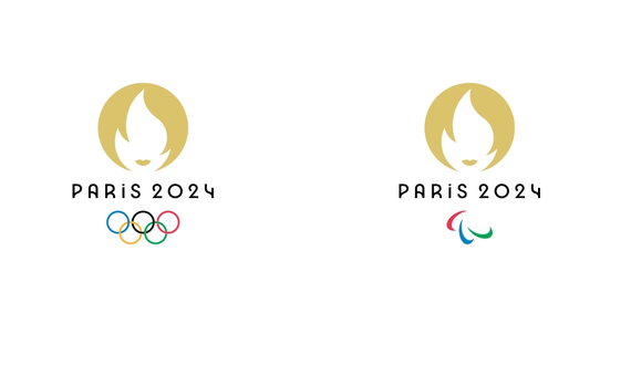
The logo for Paris 2024 is composed of three elements: the gold medal, the flame and Marianne, the personification of the French Republic. The entire emblem is presented in a circular shape, with the gold medal silhouette forming its golden background, symbolizing the pursuit of higher athletic achievements. At the center is a flame originating from ancient Greece. Below the flame, a golden lip shape is outlined, giving the emblem a short-haired woman's face.

The logo was designed six years ago in 2018. Talking about the inspiration, the designer said he had learned some stories from his daughter.
“She is in a small school in Paris with a small playground. A lot of boys play soccer inside this playground, so there is no place for other kids. My daughter says, at the school, she can't do some sports, because the boys take up all the space,” he said.
This comment struck a chord with Boyer. Why couldn’t a female figure represent the Olympic spirit? This idea became the prototype for the Paris 2024 Olympic logo.
“If you make a quick search on the internet, and you look for sports advertising or sports logos, what you will have as answers on the internet is generally boys, muscles, etc. But this is not the reality of sports, and those who practice these sports, because sports are practiced by men and by women. In our social imaginary, all the people, when they see a woman’s face, they see this as a beauty logo,and we say, No, this is a sports logo. It makes a change for that,” he explains.
However, Boyer did not expect that the Olympic Committee would adopt this idea. It wasn’t until the grand opening of the Paris Olympics that 10 golden female statues rose above the Seine River, with Boyer and his team thrilled to see their “unconventional” logo come to life, transforming from a mere sketch into reality.
Small team triumphs big competition
In 2018, no one expected that a small design company based in France, with only twenty employees, would win the competition to design the emblem for the Paris Olympics.
“We are not a big company and it's important for us to not to be a big agency with a big process. When you have too much process, it's not really good for creativity,” Boyer explained. He mentioned that the company's designers come from all over the world, including Chinese members, and anyone participated in the discussions on the design.
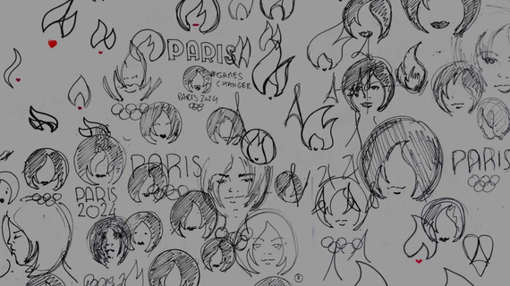
Before submitting the logo to the Olympic Committee, Boyer’s sketches underwent hundreds of revisions. “What I tried to do is to make the design simpler and easier, to not add a lot of aesthetic things, but just to be pure at the concept of the femininity and both Olympic to have the right balance,” he said.

To make the design more convincing, Boyer's team conducted a survey on female participation in the Olympics and submitted it to the Olympic Committee. The survey revealed that in the 1900 Paris Olympics, the participation rate of female athletes was about 2 percent, while by the 2020 Tokyo Olympics, this number had risen to nearly 48 percent. This demonstrates the gradual increase in the proportion of women in the Olympics.
“To be totally honest, we never thought that we could win,” Boyer said.
“We just wanted to share our idea. When we learned that we would be the finalists, it was just amazing because in fact, after we knew that we won the final competition, just being one of the three agencies to go to the next step, in our minds, we had already won,” he added.
When we shared for the first time physically with the Olympic Committee, the presentation was not only based on the drawing and aesthetics, but also on what we wanted to show to the world,” he said.
When discussing the impact this design has had on his life, Boyer candidly stated that it hasn't brought significant changes so far. However, he finds comfort in knowing that this logo conveys an important message to the world: Beautiful is Boring. Li Xiang, the Chinese partner at Royalties company where Boyer works, added, "A symbol is more than just a symbol. It shouldn't be judged solely on its beauty; we hope to convey a message through it and inspire change."
Building a Cultural Bridge
Boyer shared that, influenced by his Chinese colleagues, he has developed a deep interest in Chinese culture and is actively learning more about it. To him, Chinese characters resemble design symbols, and he particularly admires the concept of "yin-yang balance" in Chinese culture.
As China's economy continues to grow, more French companies are seeking opportunities in the Chinese market. Li expressed that in the future, through symbol design, their team hopes to build a cultural bridge between China and France. Their goal is to help more Chinese brands go global while also aiding French and European brands in entering the Chinese market.


